

In 2015, DJI set the standard for drone technology and flight experience, but its mobile shopping experience hadn’t caught up. At a time when users were rapidly shifting to mobile, buying a DJI product on a phone felt disconnected from the brand’s leading-edge image.
I led the product planning and UX design for DJI’s mobile online store, bringing the shopping experience in line with the quality and innovation the brand is known for.
To comply with my non-disclosure agreement, I have omitted and obfuscated confidential information in this case study. All information in this case study is my own and does not necessarily reflect the views of DJI.
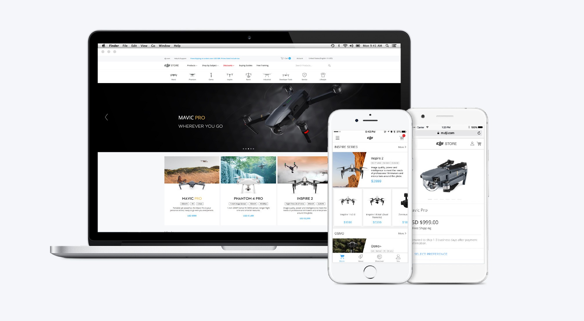
DJI is the global leader in consumer drone technology, holding up to 70% of the market at its peak. As the company expanded rapidly, it began to focus not only on product innovation but also on delivering a more complete and seamless user experience—from flight to purchase.
Between 2015 and 2017, DJI’s mobile shopping experience evolved significantly. What began as a simple HTML5 page embedded in the app gradually transformed into a more comprehensive in-app store, supporting multiple product lines, cross-border shopping, and promotional campaigns. This shift reflected DJI’s broader commitment to elevating the customer journey beyond the product itself.

The Challenge
My Role
From June 2015 to August 2017, I led the design of DJI’s mobile shopping and checkout experience across iOS, Android, and HTML5. My work covered all key flows from product browsing to payment.
In addition, I collaborated with a cross-functional team of designers, marketing specialist, engineers, and product owner.
After over a dozen versions were released, I wrapped up my work on this project after the app shifted to focus solely on shopping and support.
Research
Data Analysis
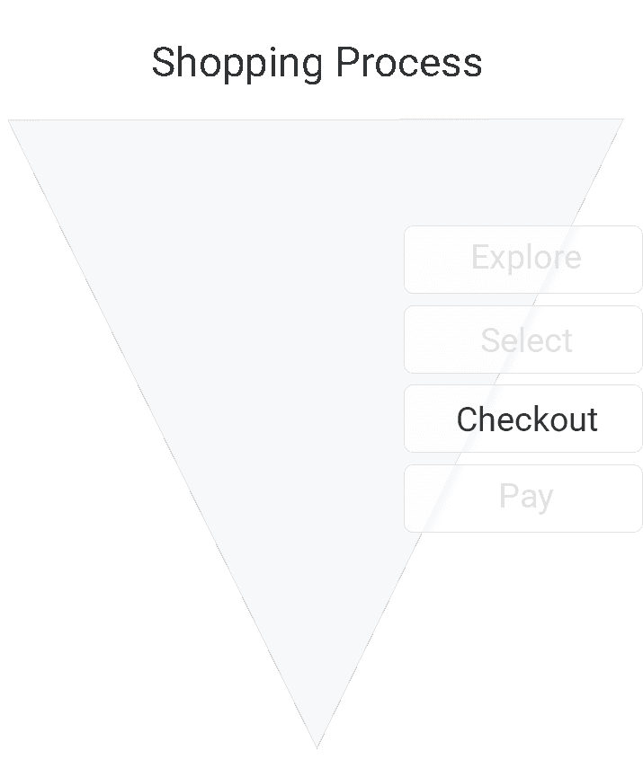
To improve the app performance, we implemented funnel analysis within the app to track user behavior throughout the purchase flow. By comparing this data with competitor benchmarks, we identified key drop-off points and made targeted improvements to boost conversion rates.
User Interviews
To achieve our goal above, we conducted user interviews alongside redesigning the app interface. The aim was to uncover pain points in the purchase journey and identify key motivators that bring users back to the app.
Key Insights:
• The app’s responsiveness still needed improvement, especially with embedded HTML5 pages creating a disjointed experience.
• Users wanted an easier way to compare product models when shopping, but mobile screens made this more difficult than desktop.
• Some key steps in the shopping process still had significant room for improvement.
• Most users only opened the app during new product launches, they need more reasons to use the app frequently.
• Many users expressed interest in getting recommendations for nearby flying spots, which could drive more frequent app usage.
I have intentionally omitted confidential data here.
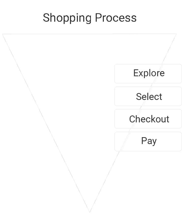
Solutions
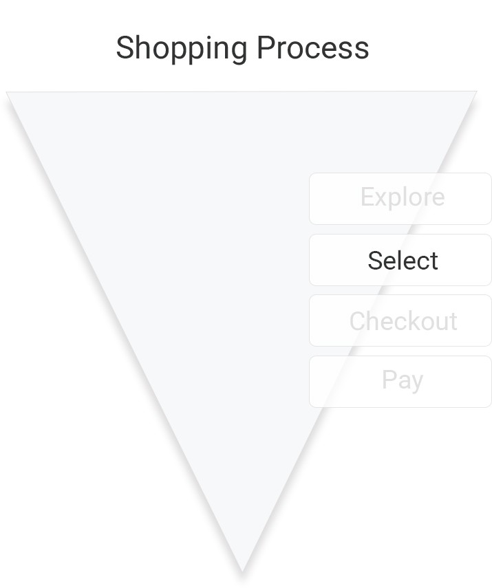

↑ Selection Flow Created in Sketch
Solutions
Also, we introduced a product comparison feature in the shopping selection flow, especially for new product launches, allowing users to easily compare key specs and selling points between models.
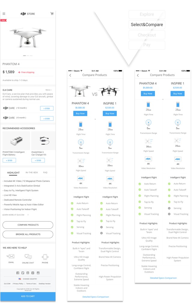
↑ Interfaces Created in Sketch
Solutions
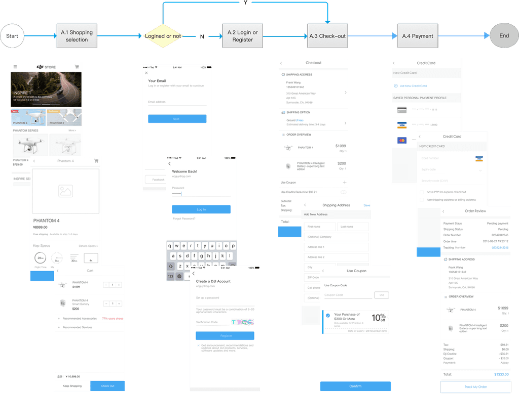
Also, we enhanced the checkout process across all platforms by refining the order placement logic:
• Tailored the experience for different user types
• Optimised the flow for each stage of the shopping journey
• Improved content design and introduced clear, timely notifications
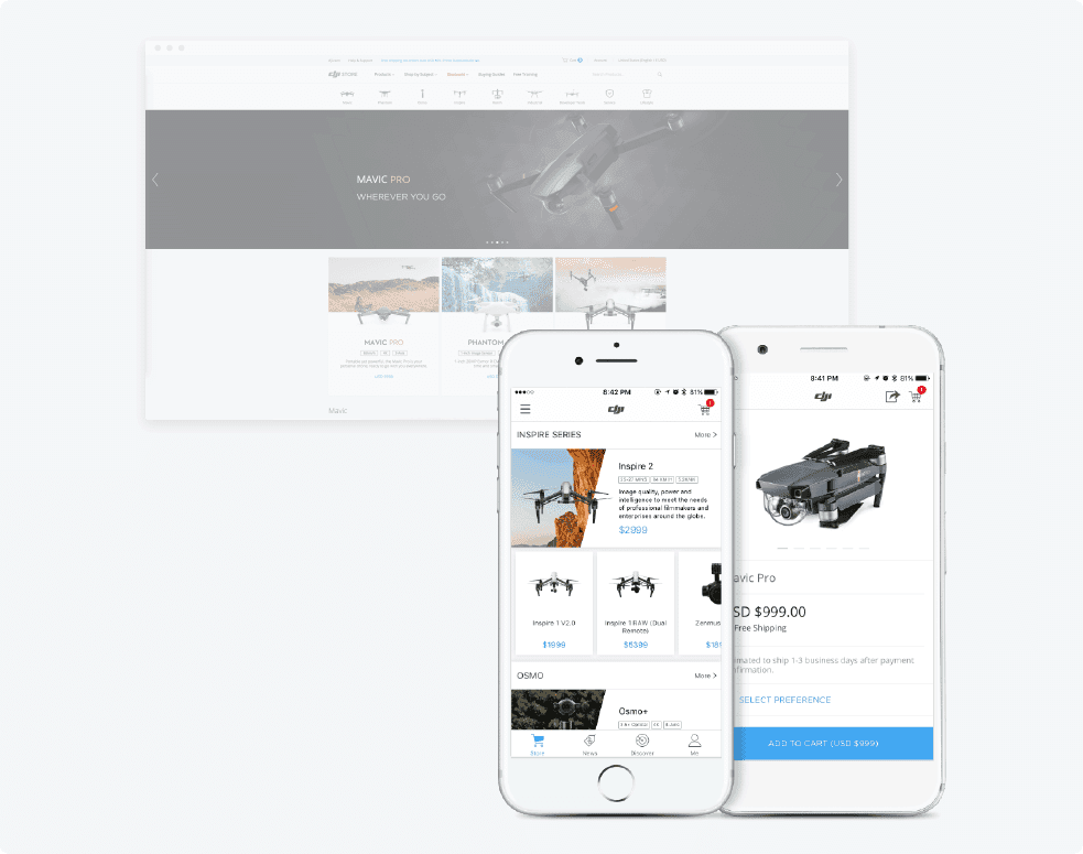
Here, I take the desktop flow as an example, shown below.

Solutions
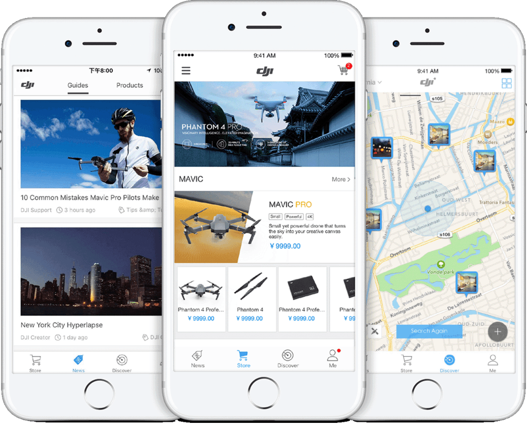
To increase customer retention and add more long-term value, we expanded the app beyond shopping by introducing new features, namely DJI Discover, in April 2025, including:
• Store: One-stop shopping and a quick way to find nearby authorized dealers
• News: Product tips, buying guides, and aerial photography tutorials
• Discover: Nearby flight hotspots to help users capture stunning views with ease

↑ App Logic Framework
Solutions
• New Products: Get the latest news of new products and preorders.
• Promotions: Get first-hand discounts.
• Online Shopping: Place an order effortlessly on phone and track order status anytime, anywhere.
For details of the prototype, please view:
https://bit.ly/zqteddy Password: zqted
↑ Online Store Main Process
Solutions
News feature:
• For Users : Subscribe to buying guides, get tips for using our products, receives aerial photography tutorials and more.
• For DJI : Increase users viscosity for triggering purchase
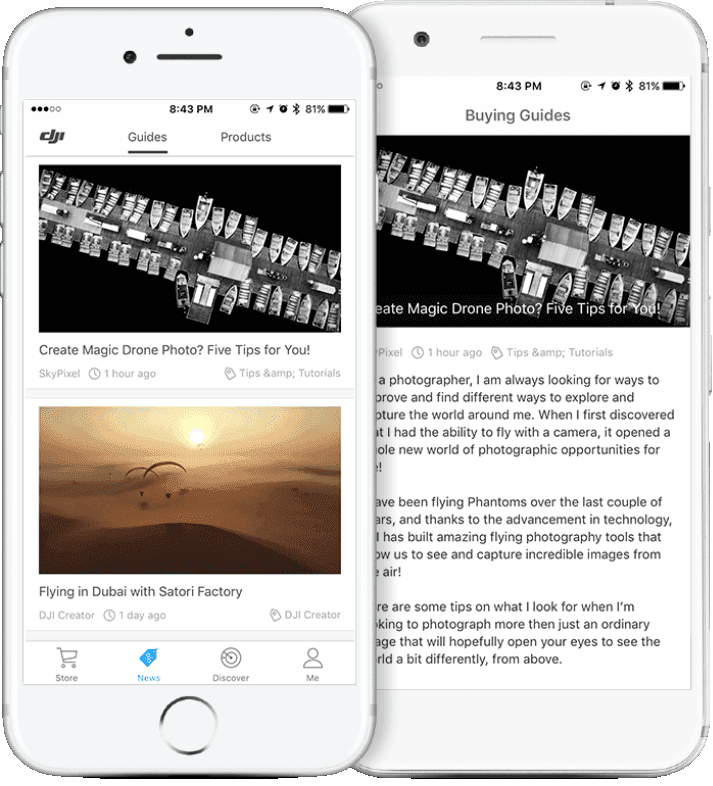
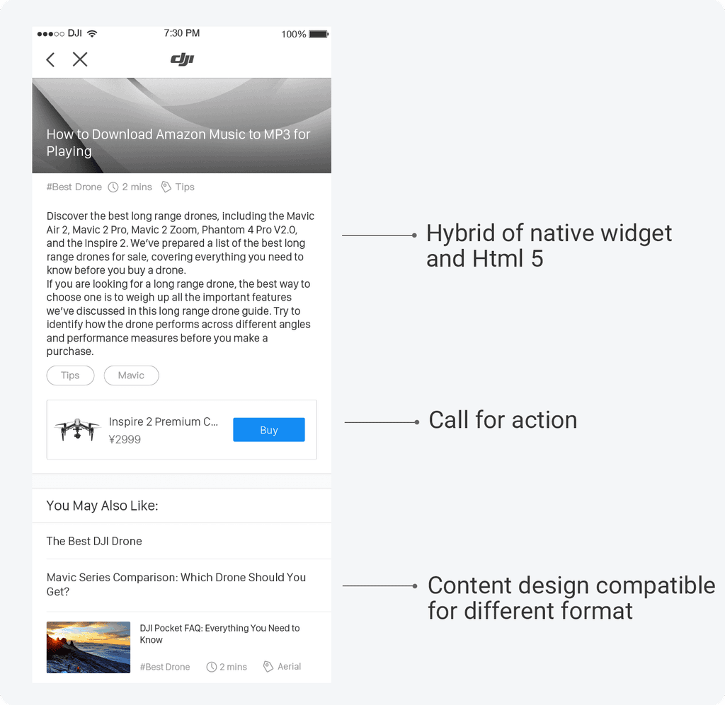
↑ UI created in Sketch
Solutions
Flying hotpot feature:
• For Users : Discover surrounding hotspots to capture amazing scenery with ease.
• For DJI : Increase the frequency of user flying drone.
• Purpose of design: Make it easier for users to share and explore the flying spot nearby.
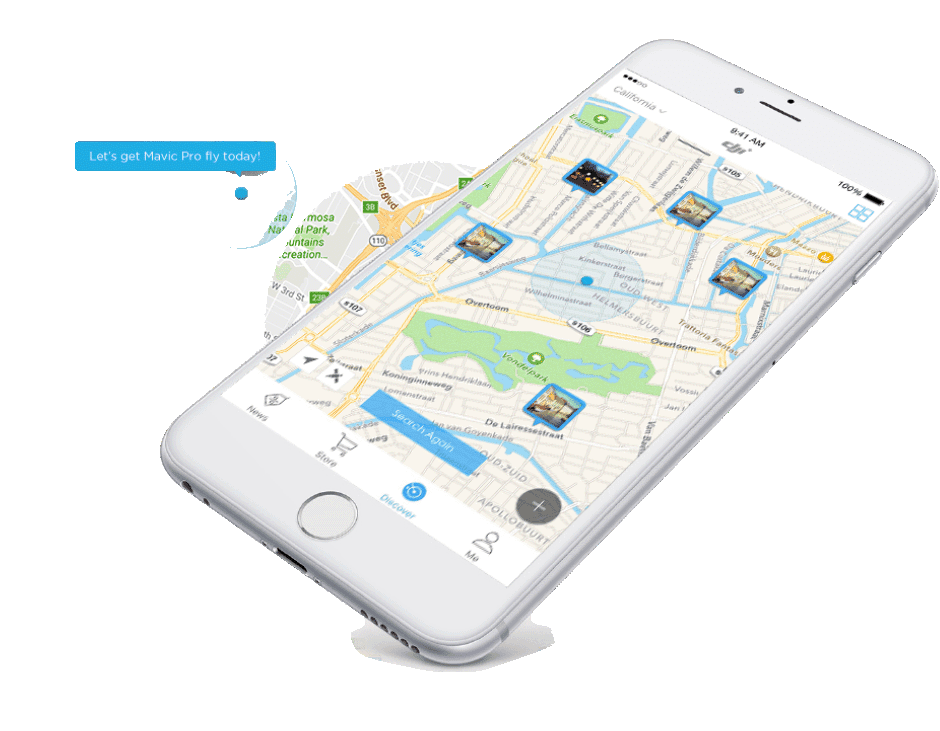
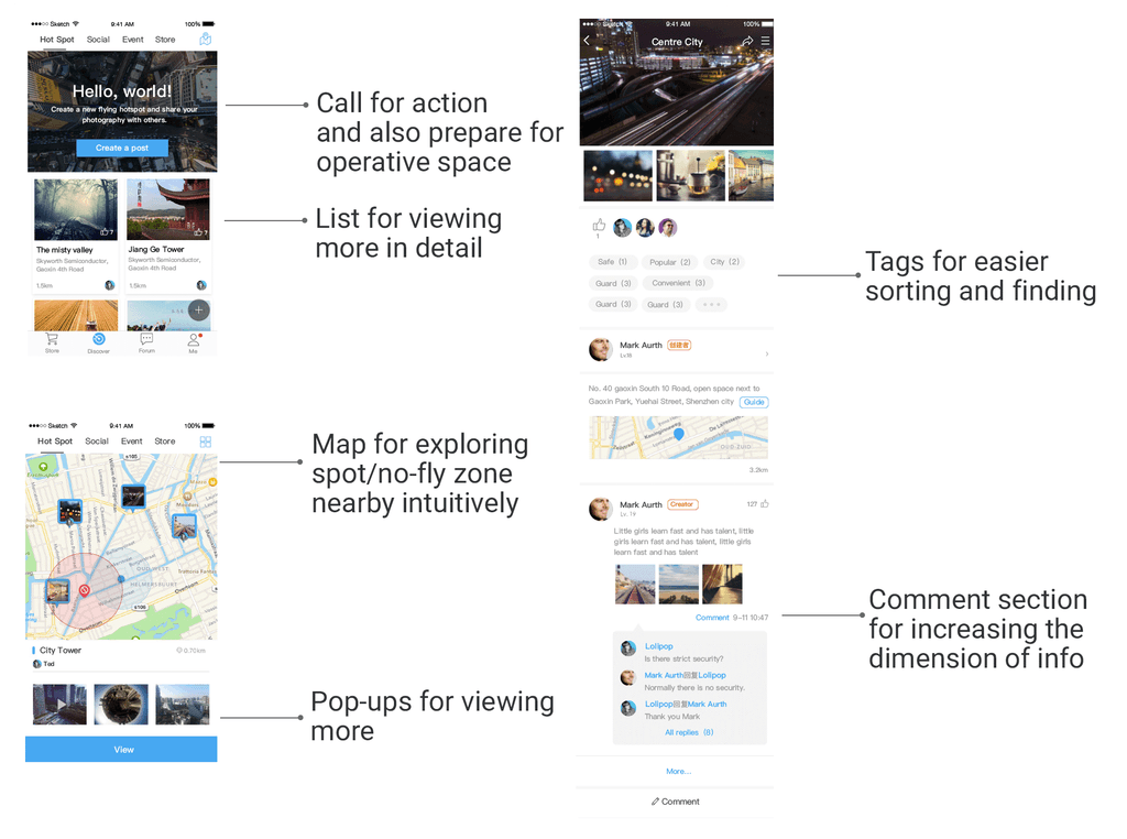
↑ UI created in Sketch
The Launch
From initial concept to launch, the Discover+ project was completed in just two and a half months. I was involved throughout the design and development process, working closely with the team to shape the experience from early wireframes to handoff-ready visuals.
On April 8th, 2016, DJI officially launched Discover+, a mobile app that combined social content, flight hotspots, and community features, transforming the app into a platform not just for shopping, but for exploration and connection within the aerial photography community.
↑ New App Launch Video on Youtube
The Impact
The redesign and rebuild of DJI’s mobile store (Android, iOS, and HTML5) was completed from scratch using Axure, Sketch, and Figma. Within the first year after launch, the mobile store showed strong performance improvements.
Total mobile sales orders increased by over 500%
Achieved 212% of the sales target for the year
Mobile conversion rate improved by 121%
These results reflected not only improved usability and performance, but also the alignment between the new design and user expectations for a fast, reliable mobile shopping experience.
For confidentiality reasons I have omitted the actual values for these metrics.