
Tabiya is a consultancy that supports leaders and teams through coaching, workshops, and strategy.
As part of an Academy Xi project, we redesigned their website to expand reach and support marketing goals.
My focus was UX design, with contributions to research and marketing when needed.


Tabiya’s website was outdated and no longer showed its shift toward coaching and business advisory. Our team led a full front-end refresh, starting with user research and ending with a new visual identity that matches the brand’s current direction.
Our goals and objectives:
• Modernise the site to showcase coaching and advisory services and attract a wider client base.
• Create a consistent visual identity, covering logo, colour, and design elements.
• Suggest ways the new design could support future marketing.
Key deliverables:
• Primary: new logo, desktop website redesign, and refined design system.
• Secondary: mobile page template, LinkedIn assets, and SEO recommendations.
Research approach:
We ran a heuristic review, competitive analysis, and user interviews, then used affinity mapping to group insights into six priority themes guiding our design decisions.
Heuristic Evaluation
We performed a Heuristic Evaluation with Nielsen’s ten usability principles to uncover early usability issues. This revealed where the interface failed to meet design standards and highlighted key friction points affecting the user experience.

↑ Snapshot of Heuristic Evaluation on FigJam
Competitive Analysis
We first researched potential competitors, noting their services, target audience, differentiators, size, and online presence to select the most relevant ones. We then carried out SWOT and heuristic reviews to uncover each competitor’s strengths, weaknesses, inspirations, and opportunities.
Insights from competitor analysis
Clarify Value Proposition
• Sharpen key message
• Shorten service descriptions in “Services”
• Resize and restyle testimonials
• Show transparent pricing
• Add workshop and event details
• Merge “Who We Help” with “Services”
Streamline Platform Navigation
• Use a clearer content structure
• Add site-wide search for easier access
• Apply consistent fonts, sizes, and spacing
• Place clear call-to-action buttons
• Offer contextual help and error messages

↑ Snapshot of Competitive Analysis on FigJam
User Interviews
We spoke with four potential users, focusing on how they locate key information, perceive the brand, and judge overall experience. Here are what stood out:
Clarify Value Proposition
• Personalised visuals resonate
• Clear testimonials build trust
• Broad, catch-all services turn users away
• Service model needs to be obvious
• Users prefer bespoke offerings
Streamline Platform Navigation
• Site should reflect industry expertise
• Content must speak directly to end users
• A search bar would speed navigation
• Consistent fonts, colours, and images improve trust
• Simpler layout and stronger contrast aid accessibility
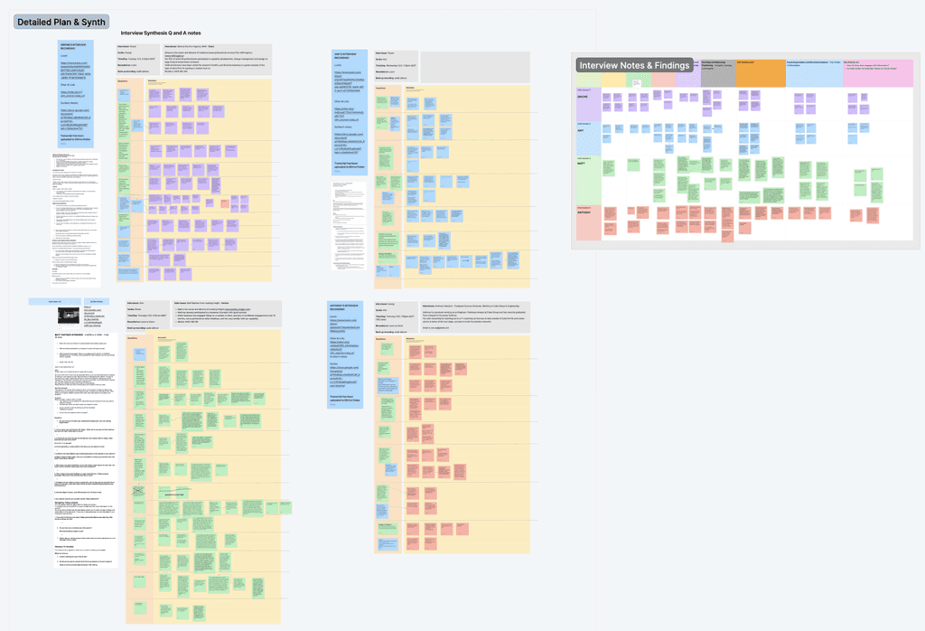
↑ Snapshot of Interview Synthesis on FigJam
Our research surfaced two core needs: a clearer value proposition and smoother navigation. We shaped these insights into a focused problem statement:
Problem statement
Tabiya’s outdated website and inconsistent branding struggle to clearly communicate its coaching and consultancy services, leaving professionals feeling unsure about its value proposition.
The lack of clear and structured information, and personalised touch reduces user confidence in brand credibility and leaves potential clients feeling hesitant to engage, ultimately hindering Tabiya’s growth and client acquisition.
Personas & User Journeys
Based on what we found, we generate two Personas and the related User Journey keep our design focused on the target users.


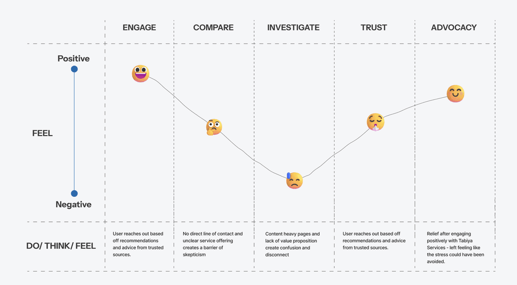
↑ Snapshot of User Journey on FigJam
To focus our ideas, we turned key insights into four How Might We questions:
• How might we simplify Tabiya’s service presentation so clients see clear outcomes and credibility?
• How might we rebrand Tabiya to attract clients seeking tailored coaching and advisory?
• How might we make the site welcoming and easy to explore, with navigation that helps visitors find information fast?
• How might we showcase Nigel’s expertise and network to build trust through credentials and social proof?
Running a session with the client
We ran a one-hour ideation session with the client to bring our ideas together and align on potential directions.
Crazy 8s
We started with a quick Crazy 8s round to sketch out rough ideas in response to our HMWs.

↑ Snapshot of Crazy 8s
Effort vs Value Matrix
After that, we mapped our top ideas onto an Effort vs Value Matrix to spot quick wins: those high-impact, low-effort ideas worth prioritising.

↑ Snapshot of Matrix

↑ Snapshot of MVP
Based on the issues we uncovered: outdated visuals, unclear service structure, and a lack of clear value messaging, we started exploring ways to make Tabiya’s offerings easier to understand and more engaging for professionals visiting the site.
To address this, we focused on:
• Redesign the first fold to build trust at first glance
• Restructure content to explain each workshop, audience, and gains
• Group services by user goal and career stage
• Highlight outcomes and benefits upfront
• Strengthen visual hierarchy for faster scanning and comparison
• Apply a consistent, modern look and tone
• Test low-fi wireframes with stakeholders before high-fi design
These changes created a clearer, more engaging experience that helps clients quickly understand Tabiya’s value.

↑ Wireframes created in Figma
The client lacked a design system, so we built one using Tabiya’s existing style. Our main job was to create high-fidelity prototypes with this system, and we also added missing pieces like buttons and cards. These updates made the overall design more usable and consistent.

↑ Design system created in Figma

↑ Logo created in Figma
After low-fidelity drafts confirmed our structure and content, we built high-fidelity wireframes that merge visual and functional detail. These screens refine layout, hierarchy, and tone, present Tabiya’s services clearly, boost trust, and guide visitors to act.

↑ Screenshots of Desktop Hifi-wireframes created in Figma

↑ Screenshots of Mobile Hifi-wireframes created in Figma
We asked the same four interviewees to test an early desktop prototype while sharing their screens. Each completed six tasks: finding Clients, About Us, email contact, Workshops, Partners, and booking a consult.
A task finished within 30 seconds counted as a success; users then rated its difficulty from 1 (very easy) to 5 (very hard). Clients, About Us, and email contact page scored high success and low difficulty. Partners, Workshops, and booking a consult took longer and drew higher difficulty ratings.
Improvement Findings:
• Added a “Book a Chat” button beneath each service to cut scrolling and boost leads.
• Renamed “Our Partners” to “Our Delivery Partners” so visitors instantly understand its purpose and credibility.
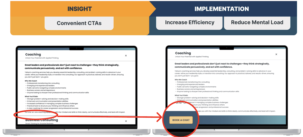
↑ Implementing Usability Insights
• User-Centric Labelling for ‘Partners’ Section
User testing showed “Our Partners” was unclear; users could not tell if it meant clients or collaborators. We renamed it “Our Delivery Partners,” which clarified Tabiya’s scalable model and expertise network, reinforcing the value proposition.
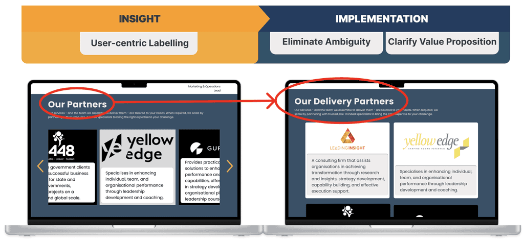
↑ Implementing Usability Insights
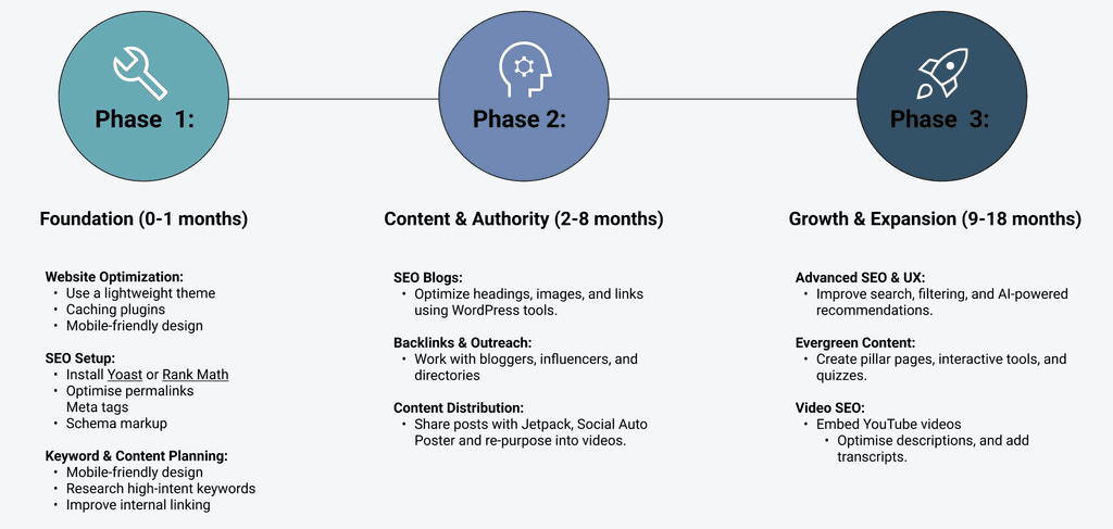
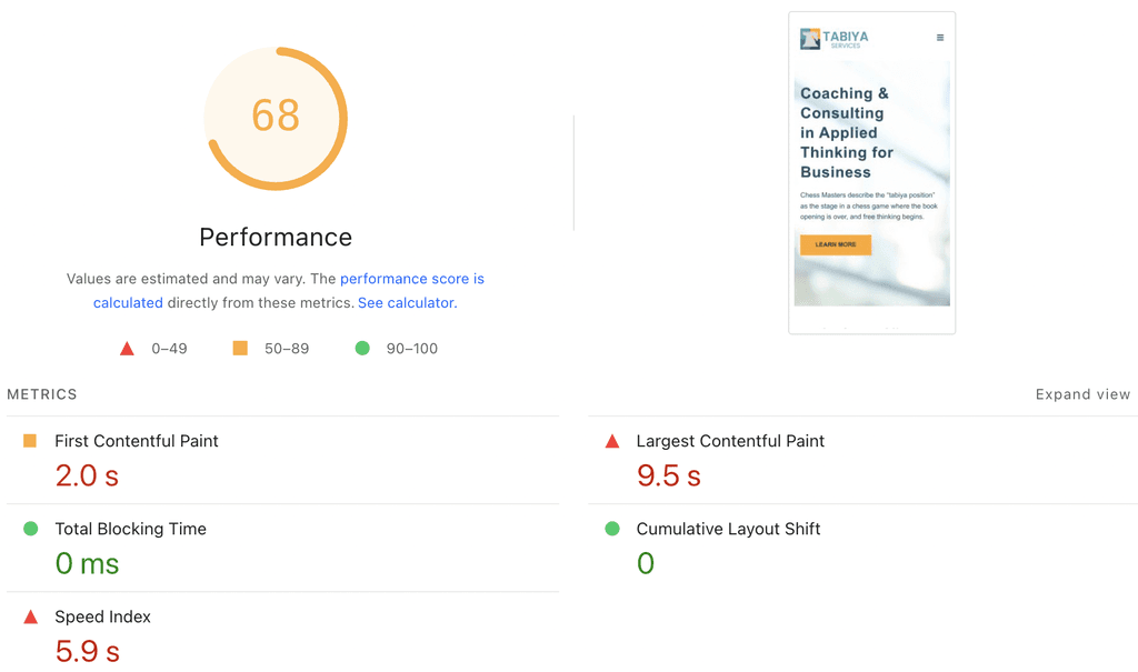
At the client’s request, I created a three-phase plan to boost Tabiya’s SEO and content reach. Phase 1, already in place, improved load speed by cutting first contentful paint. Third-party PageSpeed tests confirm faster performance, though the mobile site can still be optimised.

↑ Before for Desktop
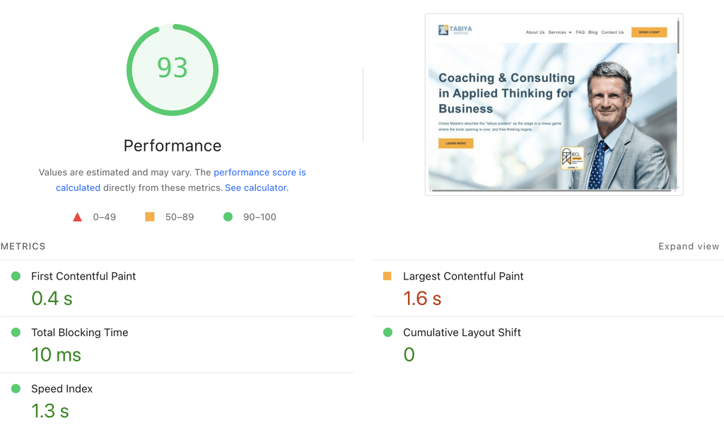
↑ After for Desktop

↑ Before for Mobile
↑ After for Mobile
We closed the Tabiya project with a final demo and, hearing no further requests, delivered all research, design files, and decision notes.
As the client mentioned, Tabiya Services was highly satisfied with the front-end refresh project delivered by our team. The client praised our clear four-week process, strong collaboration, and fast, thoughtful integration of feedback. Our user research was seen as insightful and directly shaped the design. Creative work was described as imaginative yet aligned with the brief, and the final deliverables were considered professional-grade by both the client and their independent developer. Most of our recommendations have since been implemented, and Tabiya’s new website is now live. Overall, the project was seen as a highly positive and productive experience.
- Summarized from Dr Nigel Nutt
Key Learnings:
Using AI to learn faster and design smarter: Before designing, I needed to quickly understand the consulting industry. Using ChatGPT and Gemini, I was able to research, organise, and verify key insights more efficiently. This gave me more clarity and confidence when shaping ideas and presenting them to the client.
A clear design process keeps things on track: We followed the Double Diamond model, which provided structure from research to final delivery. Even for a small project, this process helped us stay focused and avoid unnecessary back-and-forth. It also strengthened the quality of our solutions and the client’s trust in our work.
Using the right tools made remote teamwork seamless: Although the whole project was done remotely, using the right tools made a big difference. Figma, FigJam, Miro, and Otter.ai helped us stay organised and collaborate smoothly. Everything stayed visible and on track, which kept the team engaged and the workflow steady.