
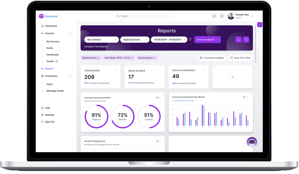
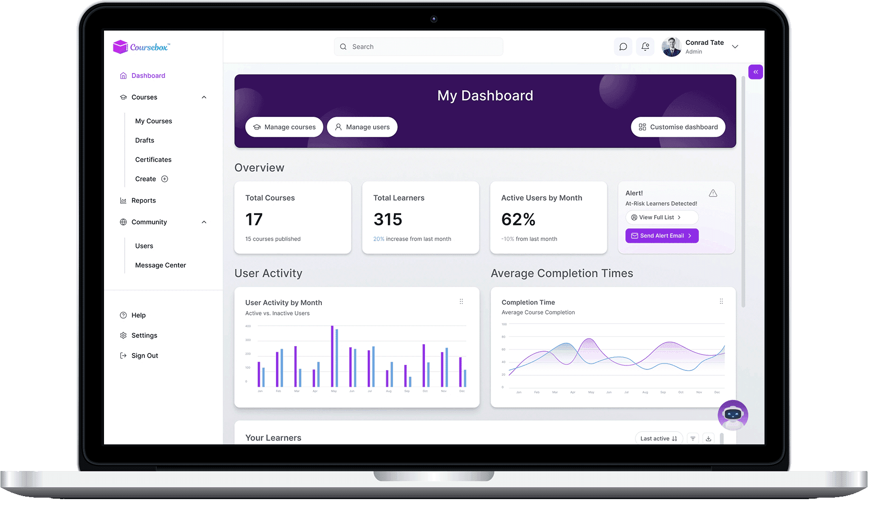
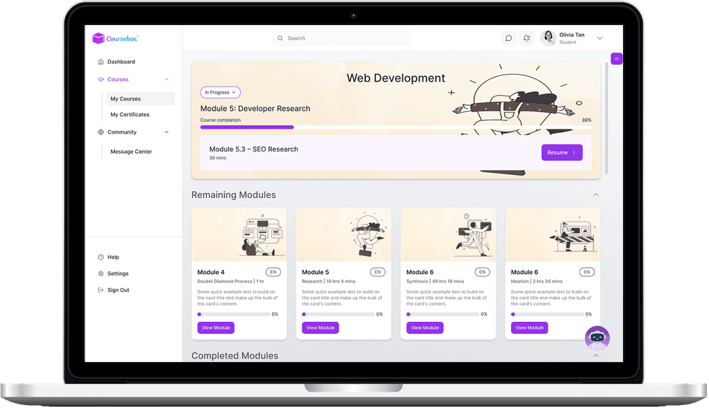
Coursebox is an AI-powered learning platform for educators, course creators, and learners. Academy Xi (us) was tasked with designing a customisable admin dashboard, a learner dashboard, and a reports page.
My role focused on user research, along with contributing practical input to product design.

Our process for Coursebox AI is based on the Double Diamond Theory and Lean UX process. We aim to incorporate the key phases of Discovery, Definition, Ideation and Implementation in all of our projects:

Before a structured design process was in place, Coursebox AI released a beta admin dashboard with cluttered, poorly integrated features, making it hard to use.
We ran user research with learners and course creators to identify pain points in navigating and managing course analytics.
Our research aimed to understand user goals and workflows, spot usability gaps, and assess how well users could complete key admin and reporting tasks.
Competitive Analysis
To quickly understand the industry and identify product gaps, we analysed several competitors’ dashboards and reporting flows to benchmark against standards and spot usability and feature gaps.
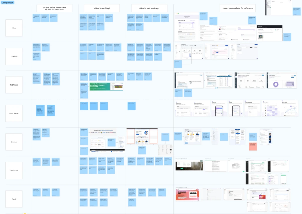
↑ Snapshot of Competitor's Analysis on FigJam
Heuristics Evaluation
We used Nielsen’s 10 heuristics to review Coursebox and identify usability issues for students and admins, revealing key problem areas.
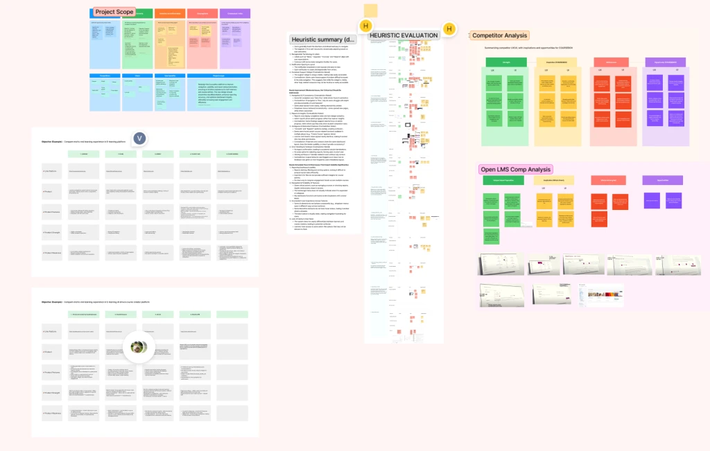
↑ Snapshot of Heuristics Evaluation on FigJam
User Interviews
I helped conduct user interviews with educators and admins to learn what wasn’t working and what they needed. We organised the findings into an Affinity Map to spot patterns. Here are what stood out:
Key Insights:
• Users want clearer views of course progress and learner activity.
• Users prefer dashboards tailored to their roles, not generic ones.
• Integrated workflows are favoured over switching between tools.
• Admins need faster, more efficient ways to manage students.
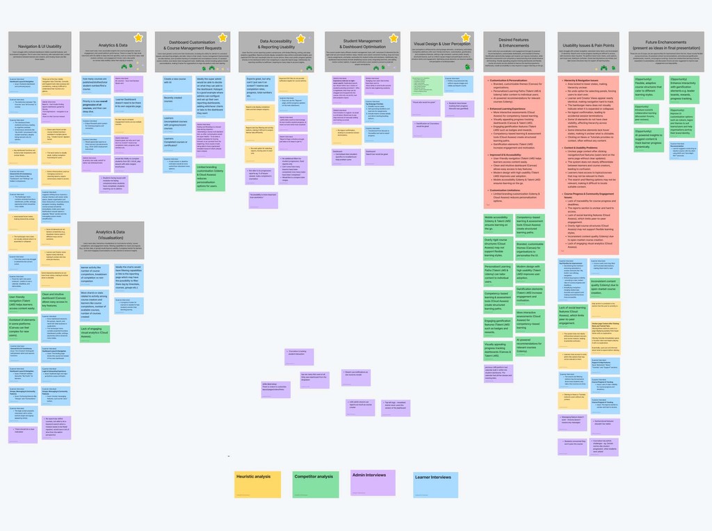
↑ Research findings in an affinity map
Problem statement
Coursebox’s dashboard lacks real-time insights and clear data presentation. Users struggle to track progress, manage content, and get quick overviews. The reporting tools are underdeveloped, causing confusion, delays, and low engagement.
Personas & User Journeys
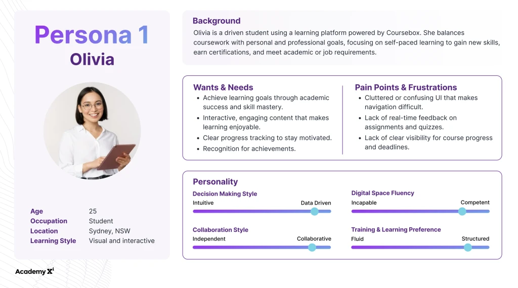
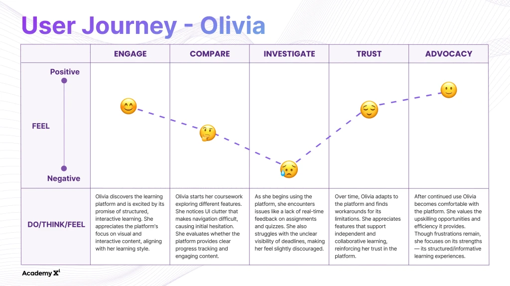
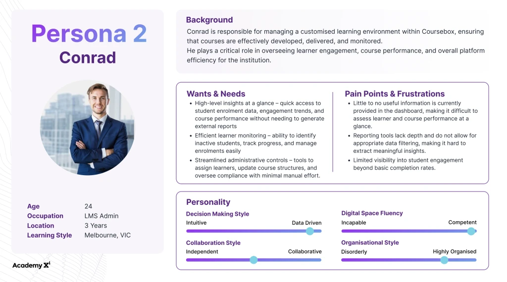
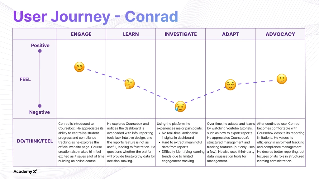
Based on our findings, we created two personas and user journeys to keep the design aligned with target users.
In order to narrow down the idea scope, we came up with How Might We (HMW) Questions, which were based off the key insights.
How might we improve student management by boosting efficiency and reducing redundancy?
How might we give users quick, high-level insights with easy access to deeper data?
How might we refine reporting with smarter filters and make insights more actionable?
How might we enhance visual design for better UX and align with industry standards?
How might we let users customise dashboards for branding and course management needs?
Running a session with the client
We ran a one-hour ideation session with the client to bring our ideas together and align on potential directions.
Crazy 8s
We started with a quick Crazy 8s round to sketch out rough ideas in response to our HMWs.
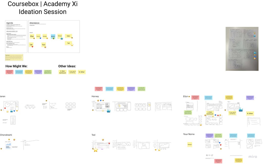
↑ Snapshot of Crazy 8s on Miro
Effort vs Value Matrix
We mapped key ideas on an Effort–Value Matrix to identify quick wins—high impact, low effort priorities.

↑ Snapshot of Matrix on Miro
Optimising Navigation: Information Architecture
Based on our findings, we restructured the Information Architecture to improve navigation—one of the main usability issues.

Before
The original sitemap revealed overlapping top and side navigation, creating clutter and adding unnecessary cognitive load for users.

After
The new sitemap removed duplicate links and grouped content into clearer categories, streamlining the experience and setting the foundation for prototyping.
Based on issues like confusing layout, scattered features, and poor visibility, we aimed to simplify the experience for educators and admins by:
• Reducing extra steps in key flows
• Surfacing insights (e.g. learner progress) earlier
• Organising content with clearer labels
• Adding flexibility for different user types
• Improving visual hierarchy for easier scanning
We created low-fidelity wireframes to test ideas and align on a structure that supports real user needs.
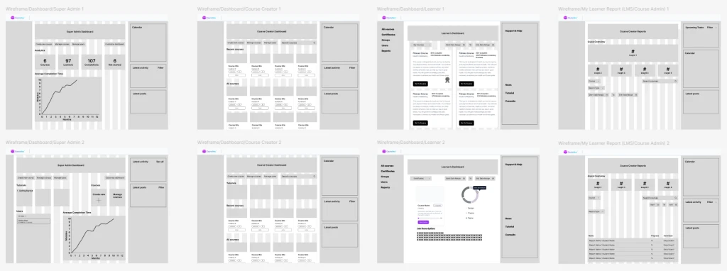
↑ Wireframes created in Figma
The client lacked a design system, so we built one based on Coursebox’s visual style.
While creating high-fidelity prototypes, we also designed missing components, like buttons and widgets, to improve consistency and usability.

↑ Design system that is visually consistent with Coursebox
Usability Testing
I helped run usability tests where users were asked to:
• Navigate to the dashboard
• Use its key features
• (Admins) Generate a report
A/B Testing
We tested two versions of the reports page to compare performance.
Usability Questionnaire
We sent a short survey after testing, asking users to rate usability, like how well features felt integrated.

↑ Screenshots of our usability testing
Overall, admin users were pleased with the dashboard design and data display. Most suggestions involved out-of-scope features. One minor request, reordering widgets, was addressed with a drag-and-drop prototype.
In contrast, the learner dashboard and reports page needed more significant changes, detailed below.
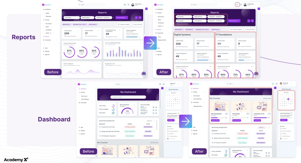
↑ Changes have been highlighted for the reports and learner dashboard
Our main task was to create a high-fidelity prototype for the course admin dashboard. Using wireframes and research insights, we designed a layout with helpful widgets, some of which became design system components.
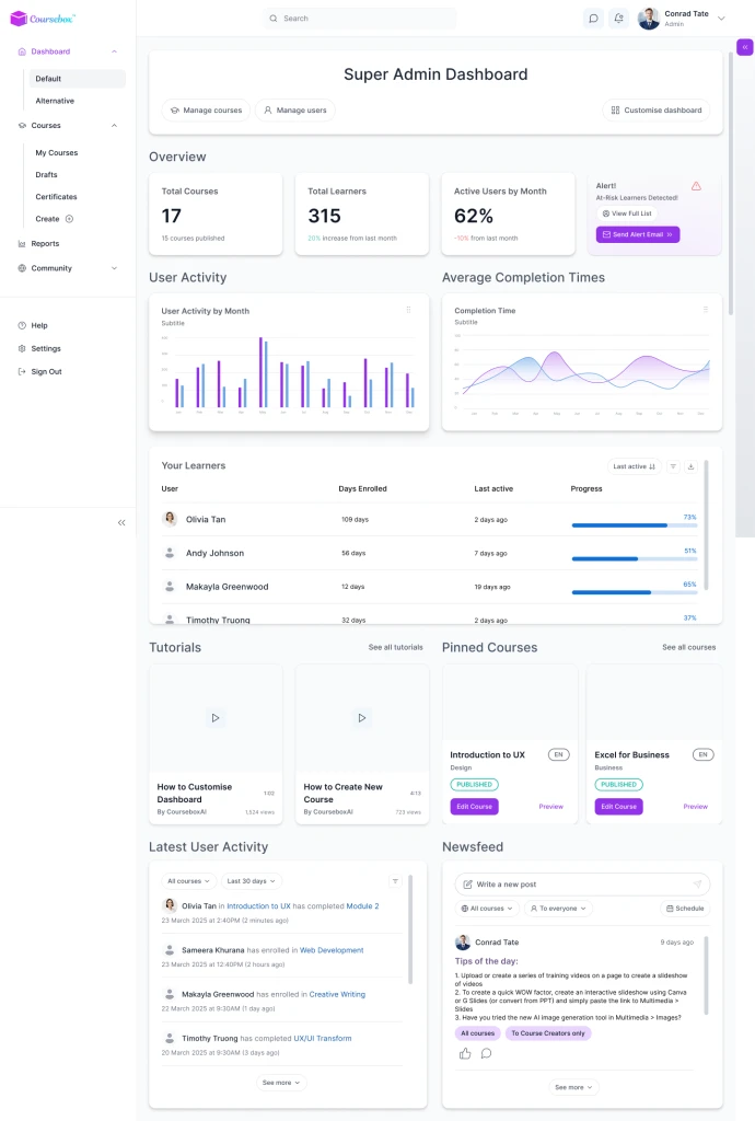
Version 1
Focused on function with plain widgets and a simple layout.
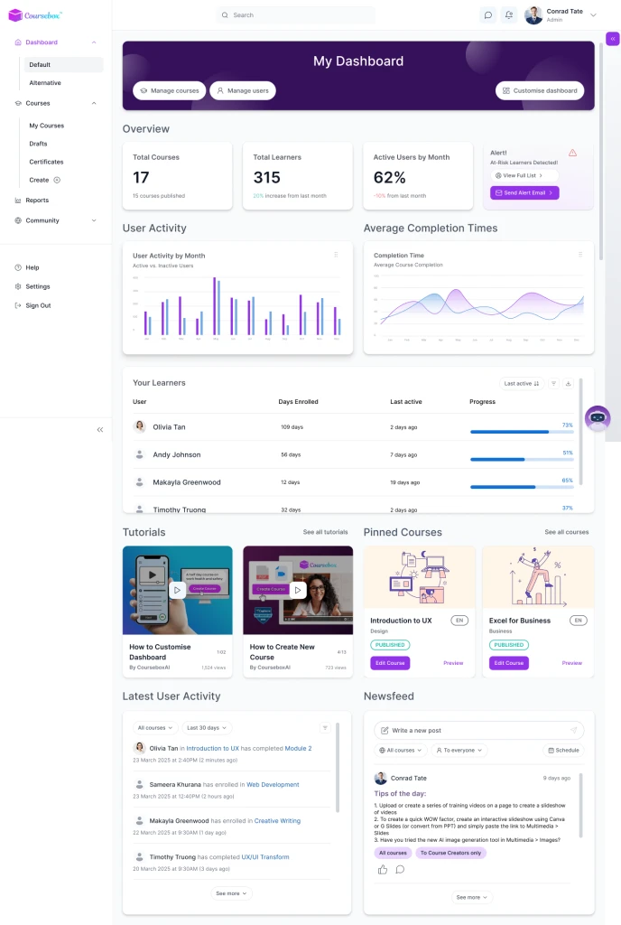
Version 2
Added colour and styling to improve visual hierarchy; used for usability testing.
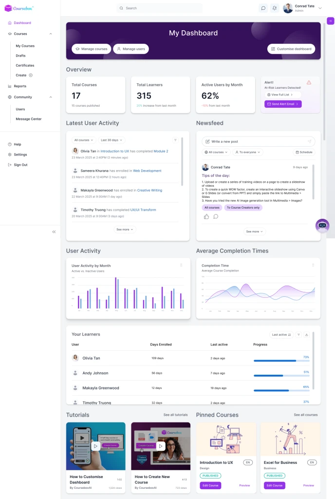
Version 3
Adjusted the prototype based on user feedback to enhance customisation.
We concluded the Coursebox project with a final presentation and received no further feedback. For handoff, we shared all research, design files, and notes explaining key decisions and methods.
Key Learnings:
Understanding AI Limits: I learned not to overestimate AI capabilities—like expecting a chatbot to generate reports without extra development or APIs. This shifted my focus to designing patterns that guide AI use effectively.
Adapting to Rapid AI Changes: AI tools evolve fast. One idea we thought was impractical became feasible days later with a Google Gemini update. Staying current is crucial to bridge tech potential with user needs.
Designing Differently for AI: AI reshapes how we design—it’s not just about UI anymore, but about helping systems understand user intent. It’s pushed me to rethink methods and empathise more deeply with user goals. - For more reflection on this part, visit my blog.